A F@#king Cup of Coffee
Inspiration - The cover art for the Moments Pass 7” by Hot Water Music.
*SOLD

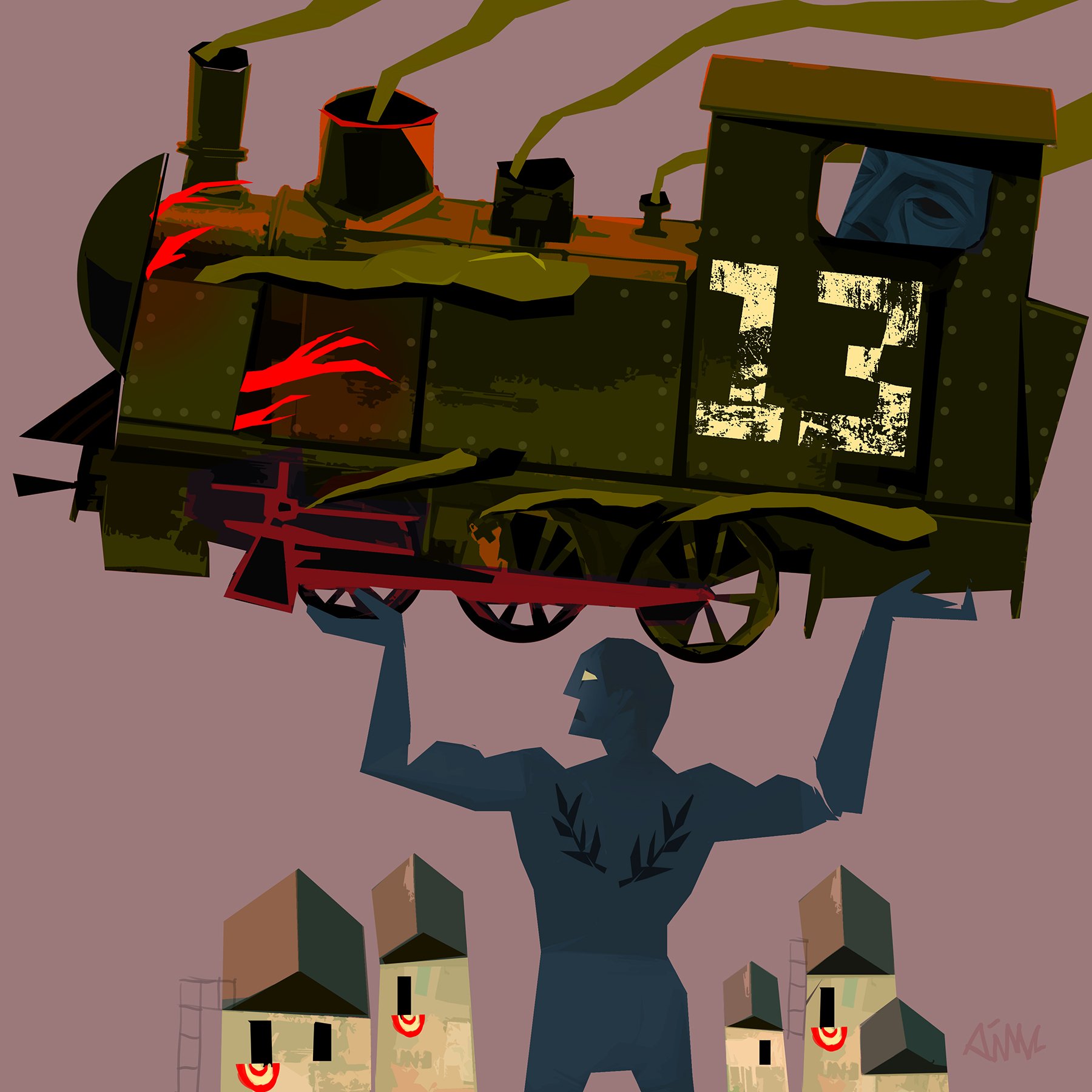
Man VS The Machine. “It’s too early for this shit.”
Acrylic on wood panel, 25 x 25in, Ampersand panel frame (black.)
*SOLD

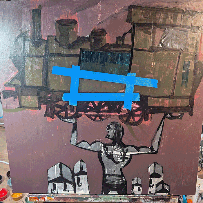
Framed next to the original art.
*process
The title is a paraphrased Wollard Lyric. I wanted to riff off of the John Henry inspired character of the original combined with this lyric from the 7”.
The original art was comprised of two panels, a front an a back cover tied together to tell the story of a man versus the machine, inspired by the American Folk hero John Henry.
I have fond memories of the Far Side comics growing up. The concept of this hero getting to work, conquering “the man,” before his morning coffee seemed befitting of a Gary Larson panel to me. I love the tone of this painting versus the title.
My number one goal was to make the train feel heavy. I started by masking off each “iron” plate and then using a palette knife loaded with paint and just smeared paint into the masked area to build up some thick texture. After that dried a little I could use the same knife to scrape back the raised paint to great a faux weathered metal patina. This process was so much fun and a huge mess.
I am very happy with the way light from the fire turned out. I knew I wanted to do something more graphic for the fire light. I believe it reads as intended. One major challenge was not taking this too far because boy did I try. The entire panel could have easily been overwhelmed by bright red graphic elements everywhere. I was tempted to trim our hero here with bright red outlines but was able to pull them back to the front of the engine as intended. An impression of light turned graphic, done.
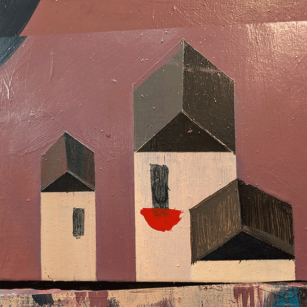
The original composition was intended to be very simple. and lite on actors. The star of the show is the Engine and the top heavy nature of the composition is intentional. I wanted all of the weight on John’s shoulders. At some point during the process, a smudge turned into autumn trees flanking our village. I l really did love them. I love turning negative space in the underpainting into positive shapes in the final. In this case though, the trees were undermining the center of gravity and needed to go. I also really wanted to preserve the isolated, lower class vibes of this village. I tend to use fire escapes and patch work texture to represent working class towns, poverty, or life in the big city. Trees were an afterthought and added nothing to the story unfortunately.
Iconography -
The bunting in the village represents hometown pride.
The laurel back tattoo is my way of designating this person a hero, an icon.
Engine number 13 represents the misfortune John is yeeting out of town. I hear the kids say “yeet” these days no?